Wednesday, 29 October 2014

T-shirt Design for the LCI Technological Skills Challenge

In CyberARTS, we have to make a design about the technological stuff that we do in LCI such as the culinary works, cosmetology, auto, wood shop, and CyberARTS.

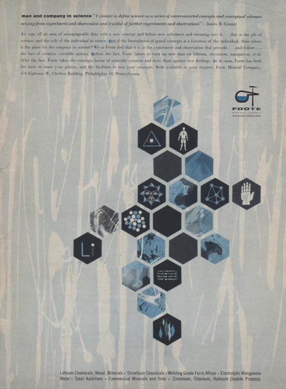
I got my inspiration when I was looking in Pinterest. I found this image: 


 I took that pattern and thought to myself that I can make icons that represent the technological stuff in LCI.


I sketched a draft in my notebook and then made it in Adobe Illustrator. There was a shape tool where I can make a polygon. This makes it easier to make my design. Then I made the pattern black because it looks simple enough that everyone can wear on a white t-shirt. I made that layer the background. After that, I made the icons in a separate file for each one. Then I copied it to where my pattern is in separate layers for each icon. After that, I made my text in a new layer. I wanted it to look bold so it have emphasis.

After that, I made variations of it in a new file.

I wished I can put more than one colours so I can make more varieties, but only one colour is the rule. I think this design sends out a message about how fun technology can be in LCI. But then I realized that there is nothing that represent LCI other than the text. Maybe I should make a phoenix because that is our animal in LCI. Overall, I'm satisfied with the design because I worked so hard on this.
Thursday, 16 October 2014

Charcoal Grid Drawing

In CyberARTS, we did a class work where we have to draw on small pieces with charcoal that makes up into a big picture like a puzzle. This picture is called The Third-Class Carriage by Honore Daumier.  The trick to this is to draw what you see, not what you think you see because it might be something else. The charcoal was messy, but I had fun with this.

 To me, this doesn't look real. There is space like the background, but the lines are too visible. Also, the lines' thickness varies throughout the picture. There were good details and shading, but I think there wasn't enough details on the faces. That's what I think for the 
imitationalism part.

For the formalism part, I think this doesn't have unity. Since each piece was made by a different person, it's not easy for the pieces to match. This makes it asymmetrical with the different values. The darks have emphasis but they are in different parts of the picture, which breaks the unity. That's what I think for the formalism part.

And for the emotionalism part, I think this feels very somber. The colours are dark, and the expressions on the people's faces are dull. And because of mixed values that don't match makes it also scary. And that's what I think for the emotionalism part.


Wednesday, 15 October 2014

Top 9 Garden Photos

These photos were taken on October 2, 2014 in the garden.


I like this photo because the colour on the beet stands out which makes emphasis. It could have been 4 stars if the leaf isn't there covering part of the beet. The leaf was distracting so I rated it as 3 stars.


I like this photo because the veins in the leaves that leading it towards the wall in the background making movement. Also, the wall makes contrast with the leaves. And there is more leaves in the background that are blurred which makes the leaves at the front have emphasis and repetition. I rated this 4 stars.


I like this photo because I tried using selective focus and it turned out well. But to me, this seems plain because nothing seems to . So I rated this 3 stars.


I like this photo because the flowers are placed on every row based on the rule of thirds. Also, the flowers are in focus which makes emphasis. I rated this 4 stars.

I like this photo because the plant is in focus which emphasize it but the colour is similar to the background. So I rated this 3 stars.


I like this photo because it has radial balance to it and the center is emphasized. I don't see anything bad, but there isn't anything better than the plant. So I rated this 3 stars.


I like this photo because of the cool effect on the plants. There is movement and repetition because they placed in rows. I rated this 4 stars.


liked this photo because the yellow stands stands out, making emphasis and contrast. It could have been better if that person wasn't there. But fortunately, the sunflower distracts you from that. So I rated this 4 stars.


I like this photo because the flowers are in focus and the colours on the flowers makes emphasis. It also looks simple and clean. I rated this 4 stars.